What does the future of web design look like?
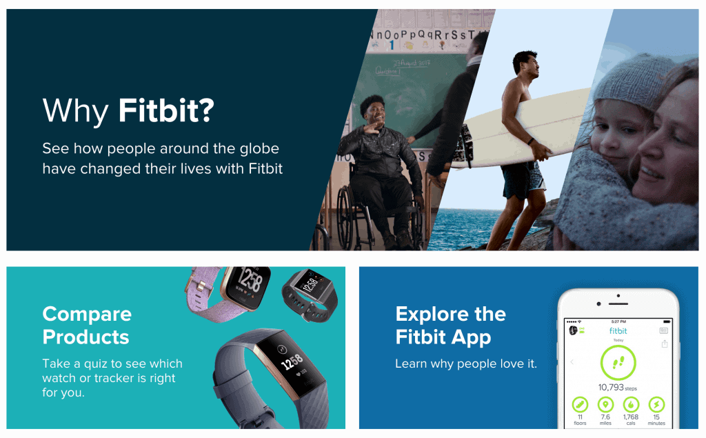
By now you’re probably familiar with designs and layouts like what fitness brand Fitbit uses: Different panels that result in content that is well-organized and easy to navigate.
So what more could designers and developers strive for?
When Microsoft first introduced Flat Design, a user interface design that made use of simple, two-dimensional elements and bright colours, people fell in love with its minimalistic, clean and clutter-free concept.
The minimalist design allowed visitors to focus on what’s important and streamlined the customer experience on a webpage.
However, an alternative design methodology has been quietly on the rise, bringing even more dynamic and powerful design and functionality to web design: Google’s Material Design.
It’s a platform that’s focused on giving a sense of physicality and realism to website elements, creating a surface that viewers can almost ‘touch’.
That means plenty of animation and interactivity on the page integrated into the user interface itself.
Website elements reflect physical characteristics like scrolling or clicking through animated movements, creating a realistic, tactile surface for the user.
Last year, Google introduced even more custom themes with a range of colours, typography and geometry that opened the doors to greater design flexibility.
These allowed developers and designers to create interesting animated designs that enhanced user experience and draw attention to certain features or messages on the website.
So if you’re curious, it’s still not too late to start learning and integrating this platform to enhance the user experience of every website visitor.
These examples below show how injecting subtle and appropriate animation effects into your website can help make your content more interesting for users to read through.
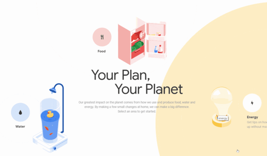
1. Your Plan, Your Planet
The site reacts to cursor movements and uses animations to guide users through its content. This simple, reactive feature helps make the user’s visit to your website a lot more fun and can help them explore the different parts of your website.
2. Serio Verify
This online cloud platform, Serio Verify, uses a fluid vertical layout that seamlessly guides users through its content when you scroll through its site. The fluid animation that brings you through the site not only gives more life to your content, it also makes users want to scroll further to see what other effects they’ll be treated to.
Websites of the past used to be very two-dimensional, but Material Design’s potential lies in giving developers the tools to create sites that are more expressive and easy-to-use than before!
In most cases, a brand’s website is synonymous with the brand itself. An interesting, animated interface opens up opportunities for marketers to convey top-notch digital brand identity while sharing your content; creating an enhanced user experience that could lead to increased brand memorability.
And implementation isn’t hard, since there are libraries of template transitions to pick from and implement to your site. More importantly, It’s knowing which motion to use to best bring across your message.
Because making a great interface ultimately means creating a streamlined customer experience by animating a visual story that makes sense for the user.
