.uk-table td{padding:0 10px 5px 0;}
#content-section h2{margin-top:50px;}
.table-with-border{border:1px solid #000; border-collapse: collapse; padding:0;}
.table-with-border td{border:1px solid #000; padding:10px;}
.half-td{width:50%;}
.triple-td{width:33%;}
Did you know that different email clients have exceptionally diverse characteristics and exceptions?
An email might not render the identically on Outlook vs. Gmail nor Gmail Desktop vs. Gmail Mobile – and even though they are the ‘same app’, Gmail iOS and Gmail Android may render that email differently too.
A well-designed email balances visually-compelling design and compatibility with email clients. Designing Electronic Direct Mailers (EDMs) while considering the quirks of email clients helps us avoid the issues that surface during development.
In this article, we will take a look at the common pitfalls of EDM design and how we can address them:
- Background Image Support
- Dark Mode
- Image Blocking
- First Fold
- Custom Fonts
- Animated GIFs
- Email Width, Retina Displays & Mobile Approach
Background Image Support
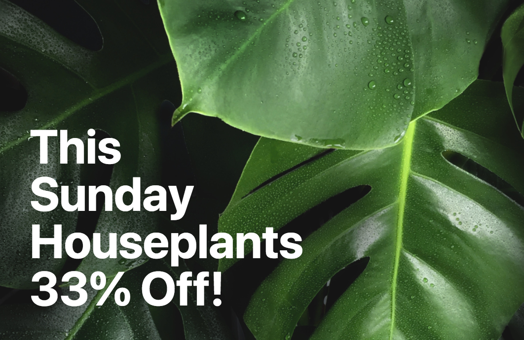
Adding background images is arguably the most straightforward way to make emails more stunning and functional.
 |
 |
| With Background Support | Without Background Support |
Some email clients don’t support the adding of background images (e.g. due to security concerns etc). Webmail clients, however, are not a major issue as all major platforms support this functionality, except for Yahoo! Mail.
Roughly half of the most popular email apps support background images. The rest provide partial support. The issue that most commonly crops up is a lack of support for the fixed CSS property background-attachment, which defines whether a background image’s location is fixed within the viewport or scrolls with its contained block.
Desktop-based email clients struggle with background images the most. Only Apple Mail 10, Outlook for Mac, and Thunderbird are fully compatible; while the rest of desktop clients have limited to no support for background images.
To increase the chances of the visibility of background images, we would advise adding a bicolor attribute to specify a fallback colour – such that if the background image isn’t visible, your text is still readable against the fallback colour.
 |
 |
| Original Image | Image with Bicolour Fallback Colour |
| Image from CSS Tricks | |
Dark Mode
With more users now having access to dark mode in apps such as Instagram, Twitter, Facebook, etc., the Dark Mode colour palette is becoming increasingly prevalent.
A 2022 study from EarthWeb found that 81.9% of smartphone users use dark mode.
Dark Mode is a popular and preferred mode of usability for a couple of reasons: It’s easier on the eyes (especially in low-light situations) and it reduces the screen’s brightness, which helps to conserve battery life.
Here’s a visual example of an EDM where the intended design was visually appealing, but rendered entirely differently in dark mode.

Image from Hustler Marketing
To optimise your emails for dark mode, here are three easy tips:
1. Make sure your logo and images can be seen in dark mode
If your logo has a white background, make sure to erase the background from your logo and save it as a transparent PNG before adding it to the email, so your logo looks seamless even in dark mode.
Image from Really Good Emails
However, if your logo is dark coloured, it can be difficult to view. A way to get around this is to add a light outline stroke to your logo so it stands out against the dark background.
 |
 |
| Image from Email on Acid | |
Alternatively, you can also create a banner with a background with the logo placed in it. This way, the logo looks great in whatever background colour the inbox provider uses for dark or light mode.
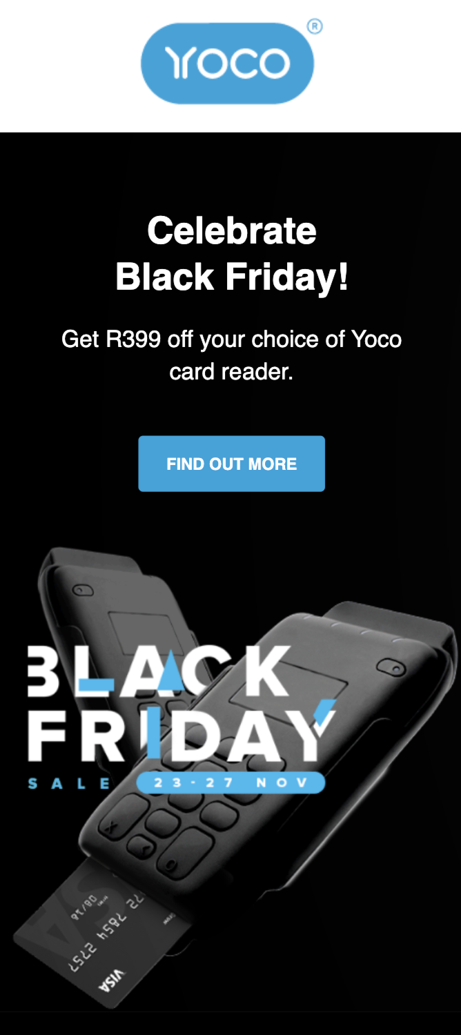
Image from Really Good Emails
You can apply these tips to any images or icons you want to use in your email.
2. Use plain text
Using images to display your text is risky with some email clients, such as Gmail on Android, since dark mode can invert the colours.
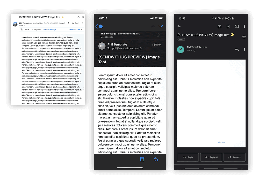
Gmail on Chrome / Gmail on iPhone / Gmail on Android
Image from Dyspatch
Plain text, on the other hand, allows the switching of dark and light mood seamlessly – all you need to do is to use a text colour that is readable in both interfaces.
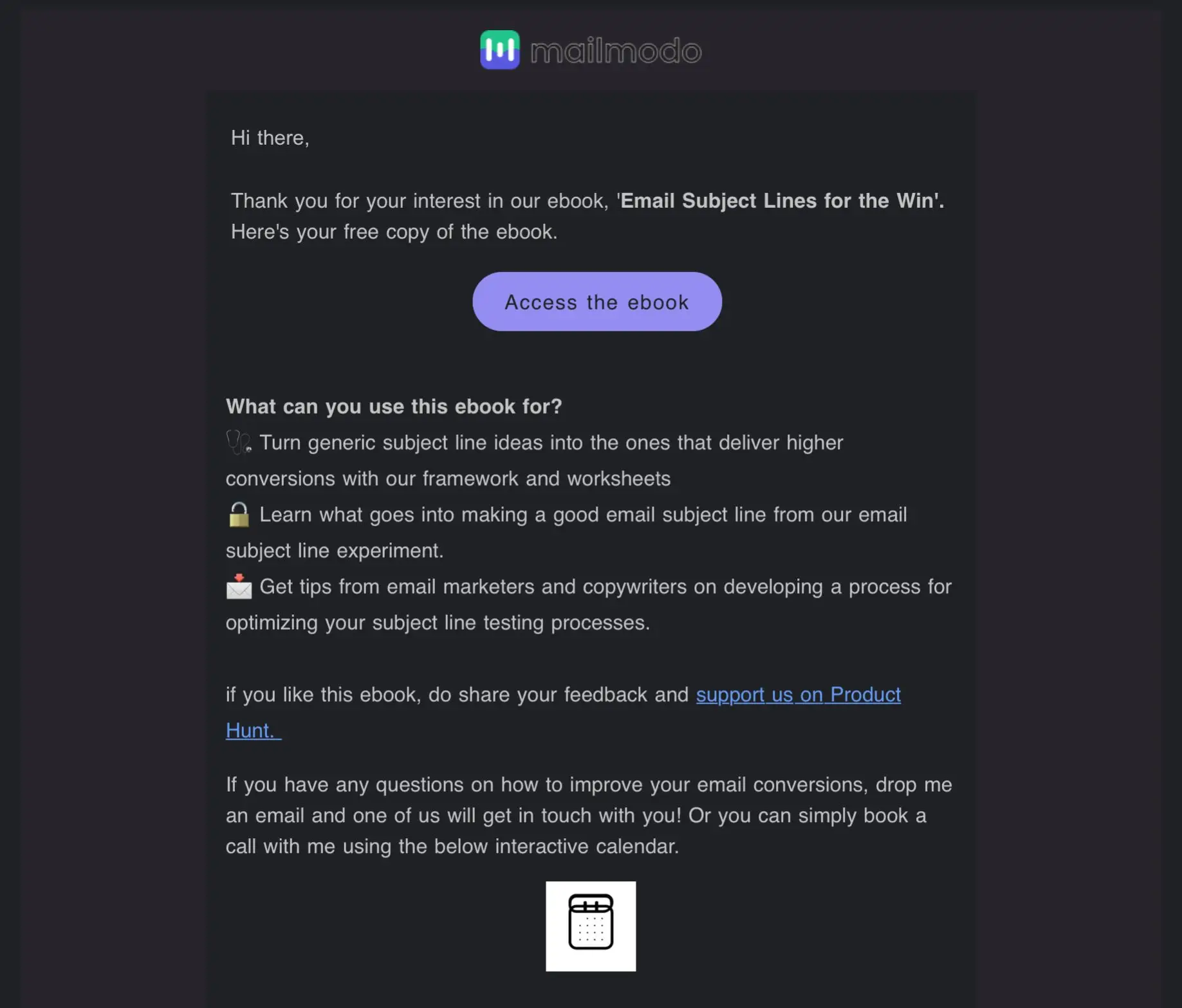 |
 |
| Image from mailmodo | |
3. Test, optimise, and test
Always test your emails before sending them out. Tools like Litmus and Email on Acid allow you to preview your email in different inbox service providers at once.
Image Blocking
As early as 2007, Mailchimp found that using a giant image in your email could cause your email to be blocked and increase your bounce rate by up to 23%.
Sending all-image emails can hurt your deliverability and cause your email to be marked as SPAM. Additionally, image blocking can happen where images are blocked from emails or not displayed by email clients or company servers. This results in images not showing up in emails.
The bottomline is that it’s ideal to convert all-image emails into live text emails. This way, you can use your images in ways that get better results for your business.
Let’s take a look at the difference between an all-image email into a live text-based.
| All-image emails | Live text emails |
| Control in maintaining brand styles
Font style is controlled across email clients and the chances of the email ‘breaking’ (where the integrity of the email design is compromised) as compared to a live text email is lower. |
Harder to create
A common misconception that many businesses have is that you require an email developer to create live emails. As we’ve seen, many email service providers (ESPs) have templates and modular building solutions. |
| Visually impactful
There are some visual effects that cannot be achieved with a live text email – although it’s not a huge issue if you’ve worked with a great email developer! |
More expensive
It does cost to hire a developer – and this cost stacks up if you get the developer to build every individual EDM. Consider hiring a developer to create a modular system instead – if you implement individual content modules yourself, you save on that cost. Lots of ESPs offer templating systems, so hire a developer to build your company a customised template system. |
| Less Technical Skills Required
Images can be easily created in any photo editing program, saved, and uploaded straight into the ESP. It’s a quick and easy way to send visually pleasing emails to your subscribers. |
Easier to update
Images have to be re-edited, re-saved, re-uploaded, and then added to your email. And they might have to be re-approved as well. With a live email, it’s easy to update a misspelt word or an incorrect date. All you have to do is find the mistake in text and correct it without going all the way back to the drawing board. |
| Less accessibility
All-image emails are not as accessible as live text emails. While some companies create all-image emails with really good ALT text, having an email that’s truly accessible for all means that it can be read by everyone. ALT text isn’t any help for those with dyslexia or users with reduced vision who use display settings to increase font size. Those are just a few of the issues that live text emails can handle much better than all-image emails. |
Better subscriber experience
Copy will be automatically resized for subscribers with higher resolution screens, and users with mobile devices won’t have to squint their eyes at super small text. Additionally, you have control over how the colours can invert in Dark Mode. Image blocking would not affect the email content and CTAs will still be viewable. |
| Missing or lost Call-to-Action (CTA)
With all-image emails, any subscribers who have their images turned off will lose any CTAs that are in your image, or anything else you may have in your email. |
Rendered differently across email clients
The truth is, most emails do not appear identically across all email clients. Having identical colours are important, but having rounded corners on your buttons, a slightly different font, or the layout being the same on a smaller screen are not issues that will affect your subscribers’ experiences quite as much as unreadable text would be. |
With that said, using an image as a background for your email while implementing live texts can still be a great way to get around text limitations. If you’re using an image, the text is still visible even when images are not presented so the recipient can still get a vague grasp of what the email is about, who it’s from, and also click on the initial CTA.
 |
 |
||
| Email with background images implemented and images turned on | Email with background images implemented and images turned off | ||
|
|||

Image from Jilt
Adhering strictly to brand guides is another reason why you might opt to use all-image emails – such that your brand fonts display in every email client that renders your image. The good news is that there are other fallback options apart from Helvetica and Arial for your live text. Explore options for a standard fallback font that is close to your brand fonts so you can take advantage of live text emails to ensure that your message gets across on all email clients.
Here’s a well-done visual example by Samsung, where Trebuchet MS font was used as a fallback headline font. The fallback typeface may not be as flashy as the original, but it still stands out on the page:
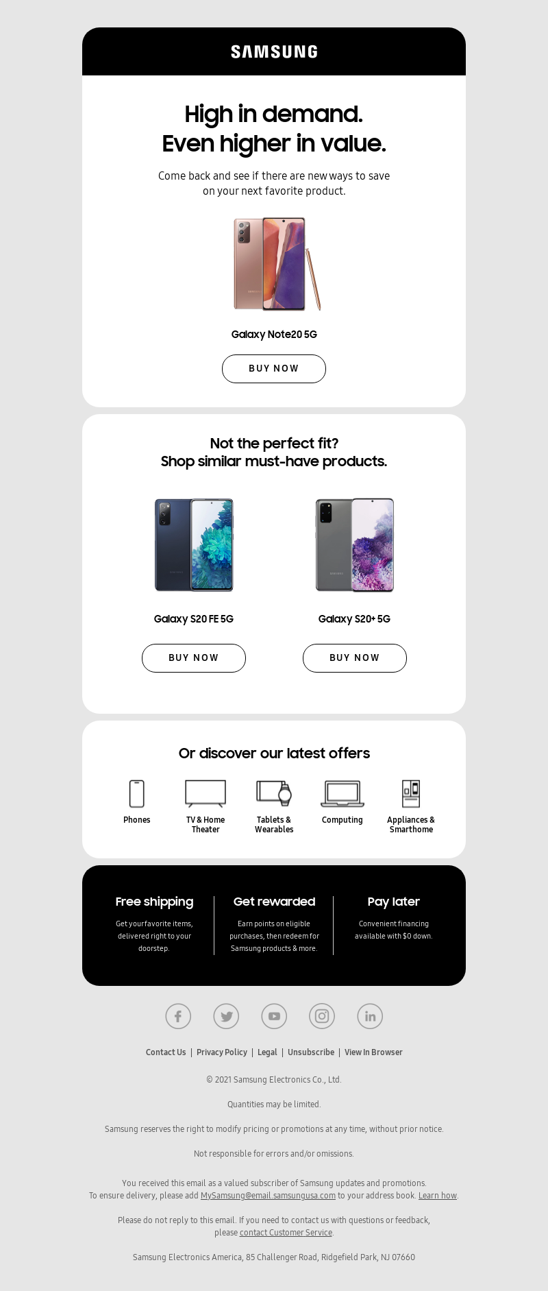 |
 |
| Email with webfont enabled and images on | Email with fallback displayed and images off |
| Image from Litmus | |
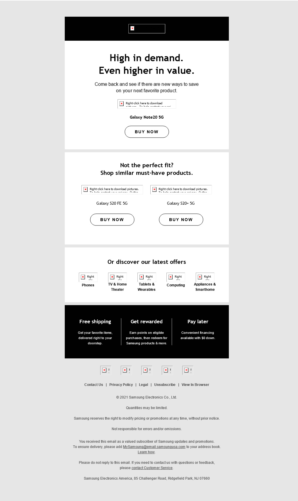
Alternatively, you could also also include ALT text for your images in case they do not render. Topman provided an excellent example of ALT text where the email’s content was still intelligible in the absence of visuals.
 |
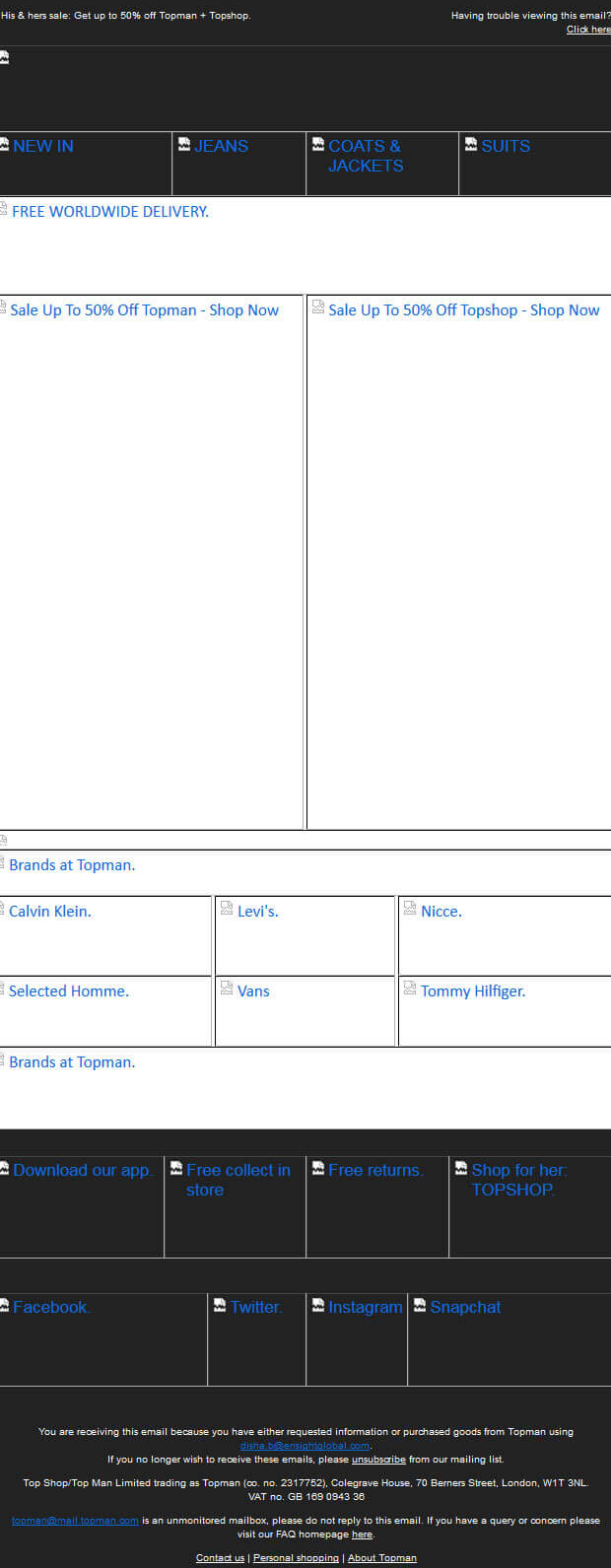 |
| Original email | Original email with images disabled |
| Image from Uplers Email | |
In essence, when architecting your email campaign, it’s important to plan for image blocking. This will help ensure that your message still gets across to users, even when images aren’t displaying, while your design can still look good.
First Fold
The fold is a term adapted from the old newspaper world, where newspapers are folded when delivered. Important headlines and content are printed “above the fold.”
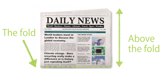
Image from Freshmail
In today’s digital context, the term “the fold” means the bottom of a screen. Anything displayed without needing to scroll is above-the-fold, while everything else is below-the-fold.
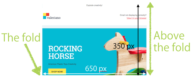
Image from Freshmail
Marketers have long assumed that the most important information should be displayed above the fold, such that users get the information they need upfront. However, a recent article from Nielsen Norman Group reported that though 80% of viewing time was spent above the fold in 2010, that same number was merely 57% in 2021.
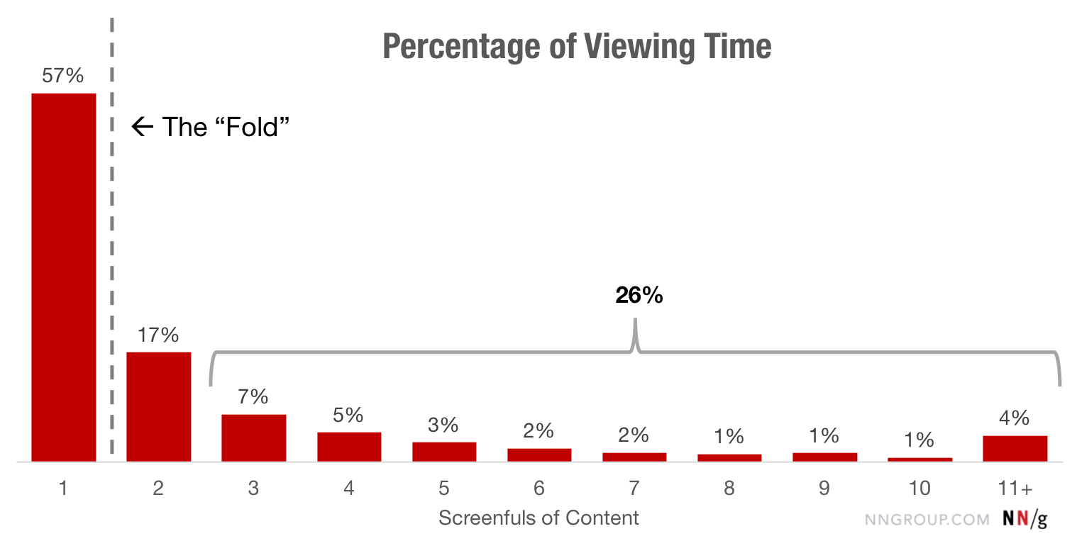
Image from Nielsen Norman Group
Why did the numbers change? Mostly because audiences are increasingly used to scrolling on their thumbs, especially with the active use of feeds on social media apps like Instagram and TikTok.
While we are becoming more like a generation of scrollers, we cannot expect that every recipient will scroll to the bottom of your email. The fold starts at the bottom of our device screens after all, and users still spend more time higher up on a page or email. So, it’s still relevant to highlight key information sooner than later in an email.
Placing your call-to-action at the beginning and centre of your email campaign improves your action rate. First impressions are important, so it’s important to make use of the limited time a subscriber spends reading your email to get them to perform your desired action. Here are some visual examples of various brands who do this really well:
Image from Really Good Emails
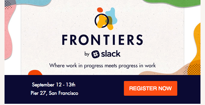
Image from Really Good Emails
Your content is still the most important factor that determines whether recipients keep reading, or stop. If you are writing long emails, try the following to make them more scrollable:
- Use the subject line and preview text to get more content.
- Use visual indicators, like lines or arrows, to hint users to keep scrolling.
- Headings help users understand and browse content easily.
Custom Fonts
Good typography is a key aspect of email design that differentiates you from your competition. Since having accessibility is also important, don’t just use images alone. Instead, use text alongside images to enhance your message, and make your content more engaging and memorable.
Live text is best done using web safe fonts or web fonts.
| Web Safe Fonts | Web Fonts |
| The browser retrieves the font from the computer’s font library. | Pulled from your owned server or an external one (e.g. Google or Adobe) |
| Limited number of fonts | Larger variety of fonts that can be used |
| Frequently used so you’re less likely to stand out | Better variety and creative freedom, but limited email client support |
While web fonts can be confusing especially with their associated cons, they are still important to a marketer. They enable you to create unique, personalised emails that are consistent with your branding style guide.
While your chosen Web Font may not work on some email clients, fallback fonts can be prepped to ensure your email still looks professional and sleek, for a good typographic experience regardless of what font appears.
The example below shows how Ace Hardware uses web fonts where they are supported, but used Rockwell as a fallback slab font to ensure the email still looked on brand in other email clients.
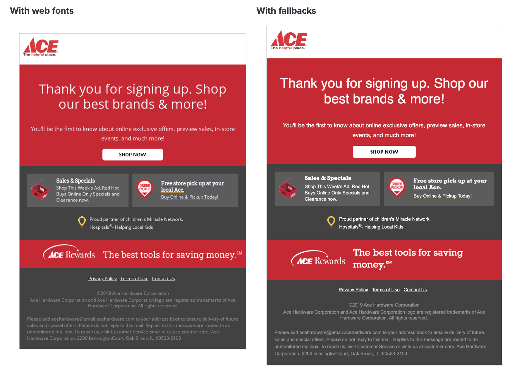 Image from Litmus
Animated GIFs
Graphics Interchange Formats (GIFs) are an easy way to add a visually striking and attention-grabbing element to your email.
However, not all email clients (like Microsoft Outlook) fully support GIFs. The desktop versions use Microsoft Word to render HTML emails. Outlook 2007+ only displays the first frame of a GIF, rendering it pointless without animation. Outlook 2019 will play a GIF once, after which a play button is displayed for the recipient to click for replay.
Outlook’s mobile and web apps, however, can play animated GIFs – in fact you can replay them without file size limitations. The animations are enabled by default, but users can disable them in Outlook settings.
With that said, it’s crucial that your call-to-action (CTA) or the most important information is on the first frame of the GIF to accommodate email clients that do not support GIFs, this way, recipients can still view the static image of the GIF’s first frame.
Another solution would be to target subscribers who use GIF-supporting and non-GIF-supporting email clients with different image content. This can be done with conditional code, where Outlook desktop clients see the static fallback image while all other subscribers see your GIF.
For example, most of your subscribers will be able to see an animated GIF in their emails:
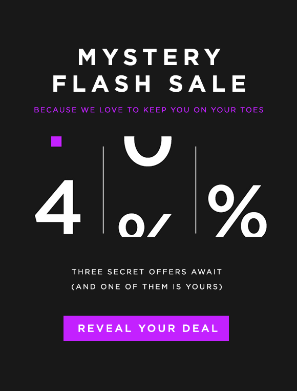
Image from Influencer Marketing Hub
Meanwhile, subscribers viewing the email on a desktop version of Outlook are shown the static fallback image:

Image from Influencer Marketing Hub
We recommend you to always test out and see whether your email’s feature will be supported in vary email clients and devices here: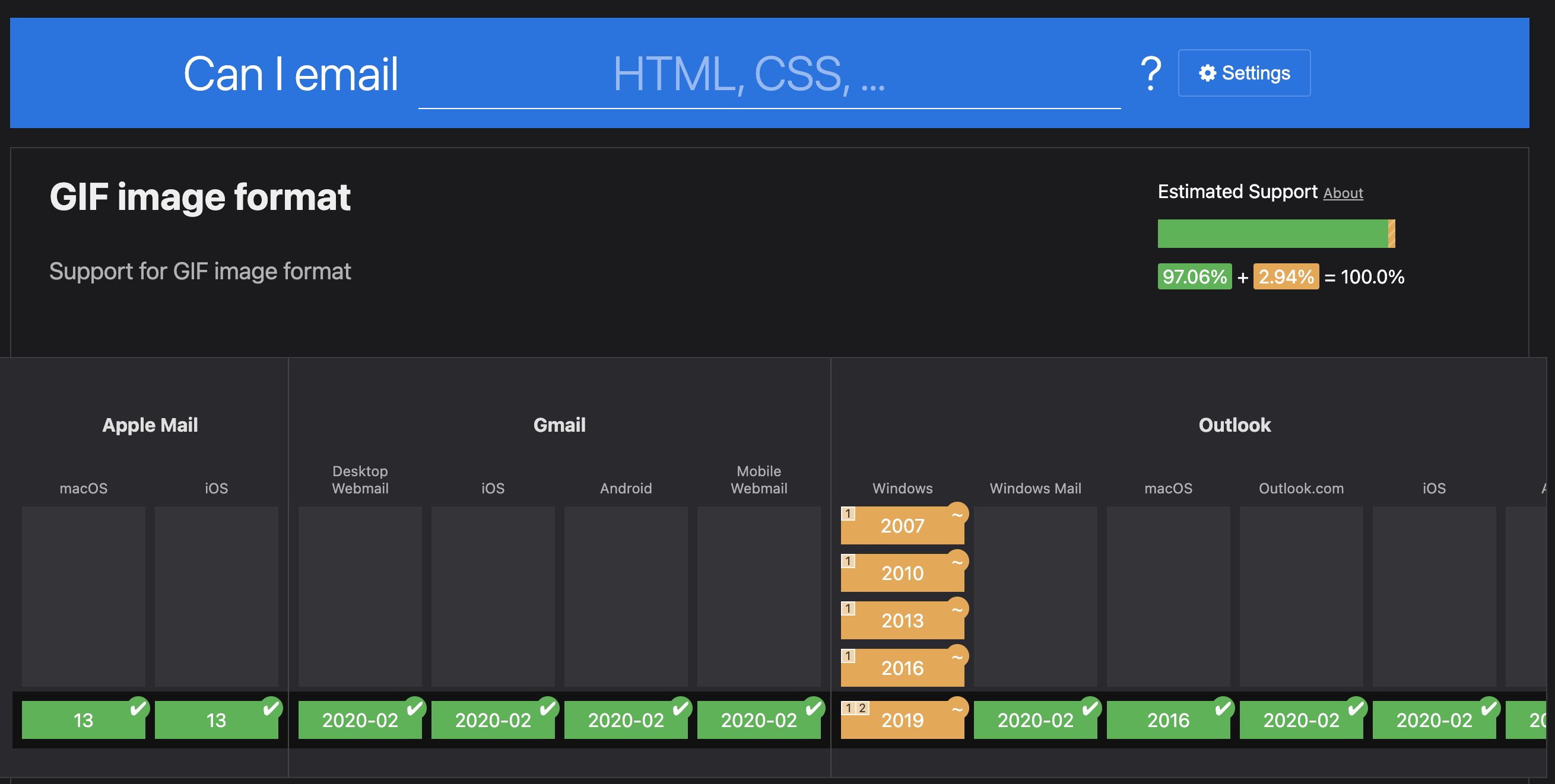
Email Width, Retina Displays & Mobile Approach
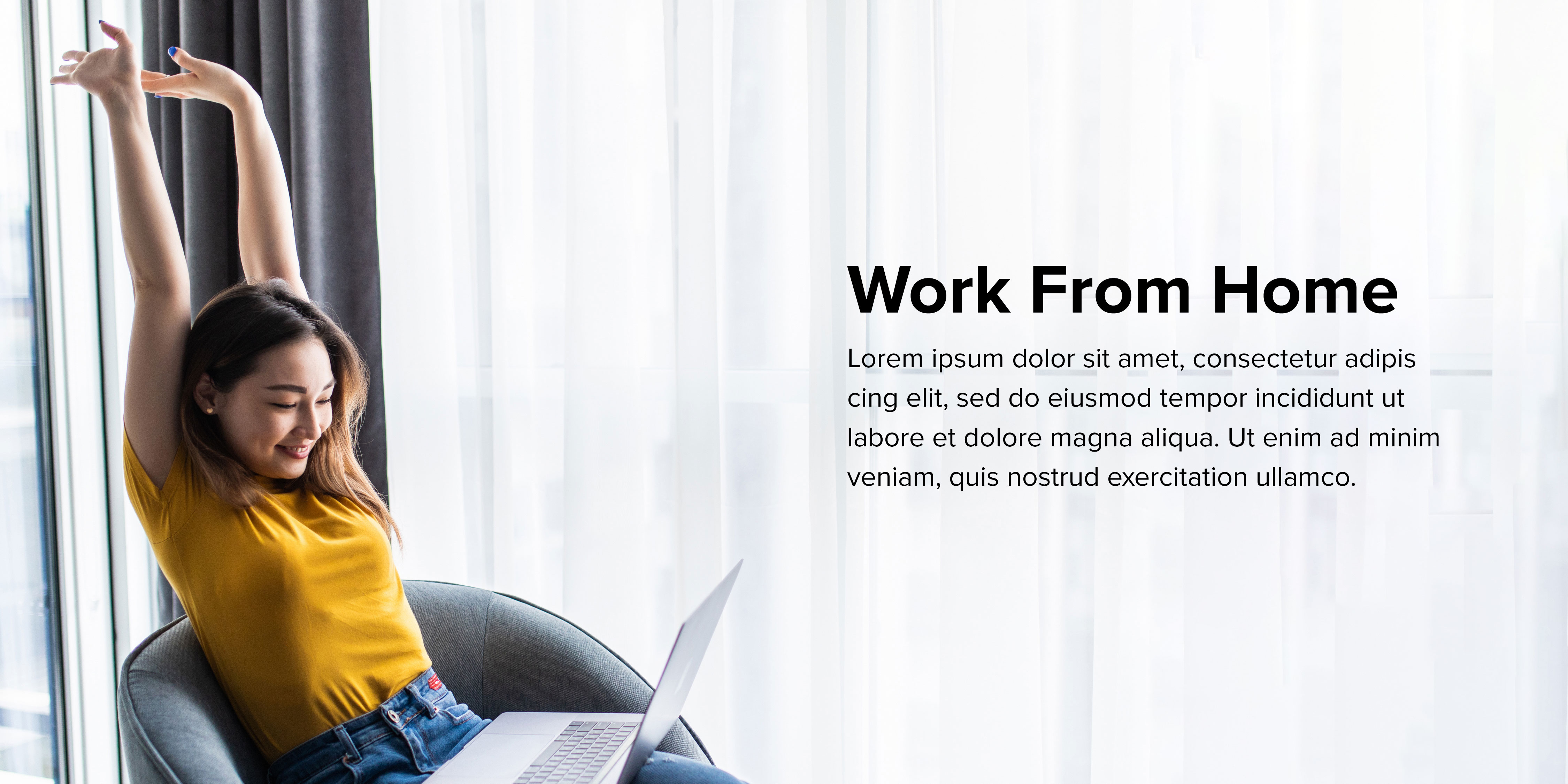
One of the most fundamental aspects of email design is the size and width of your email. Most email designs in today’s context are a full-width container within 600px wide, which is the most common size for desktop and mobile devices.
Apart from the technological revolution that’s been going on for a while now, the screen size revolution that accompanies it introduces another challenge for email designers: high-DPI displays (often called Retina displays) which can either enhance any email campaign, or give your subscribers a subpar email experience.
(If you’re unfamiliar with Retina displays, these are high-resolution displays that have a pixel density similar to that of the human eye, making text and images appear clear and crisp.)
Here’s a visual example of Non-Retina (Left) vs. Retina Images (Right):
Image from Litmus
As users grow accustomed to retina screens, they expect text and images to be clear. If your images aren’t high-DPI-compatible, your recipients see a bad email design, which can lead to distrust in your brand.
However, retina images can take longer to load because of the increased file size. To reduce file sizes, we recommend using the following external software to compress your images after saving:
- ImageOptim (Downloadable for Mac)
- JPEGMIni (Paid)
- TinyPNG (Online, Free and paid to use)
Another factor to consider besides width and retina display is the type of mobile email approach (scalable, fluid, or responsive) that works best for desktop audiences.
| Scalable | Fluid | Responsive |
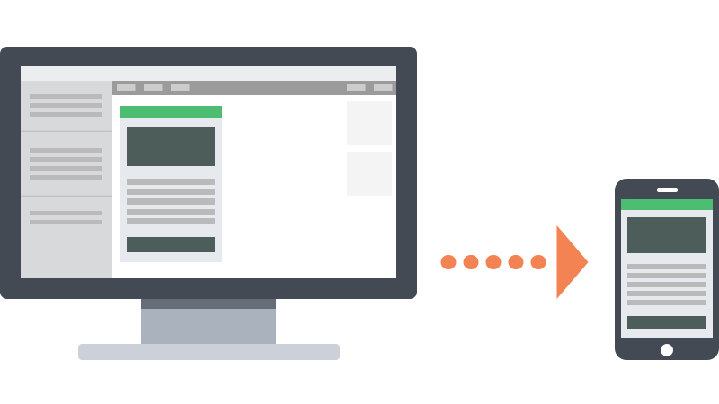 Image from Litmus |
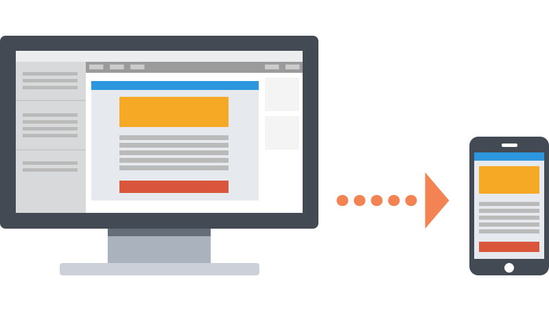 Image from Litmus |
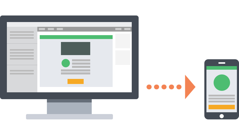 Image from Litmus |
| Any design that works well on both desktop and mobile without code. | Defined as in-between scalable and responsive design. | Takes scalable and fluid emails and adds control via CSS media queries. |
| Easiest to implement | Uses percentage-based sizing to make tables and images fit the screen, like “liquid layouts” on the web. | Flexibility to perform some email ‘acrobatics’. Content can be shifted around, hidden, and even swapped out, providing email designers with amazing control over their campaigns on mobile devices. |
| A simple layout that works well in a single column layout. Suitable for large text that works on all screens. | Work best for text-heavy layouts since there’s less control over how copy and images relate to each other. | |
| Large, touch-friendly call-to-action(s). |
If you are unable to make emails responsive try using scalable or fluid design. However, investing the time and resources to go fully responsive gives you more control and sets your campaigns apart from competition.
Conclusion
Regardless of the design approach you take, implementing bulletproof elements ensures your message remains clear to your audience, improving the likelihood of your subscribers engaging with your content. We hope this article has been insightful and enjoyable!
If you have any feedback or suggestions, please feel free to share them with us. We would also be glad to create your bulletproof emails for you.