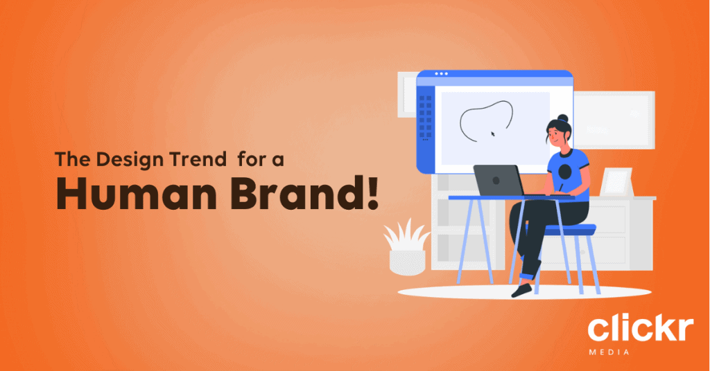
Illustrations are more than just a decorative piece for our digital spaces.
With the design trend of hand-drawn illustrations being on the rise, their imperfect and slightly abstract look injects an element of humanity into the visual representation.
As more of our daily lives shift online, brands are making the move too. More attention is now being given to online platforms and the amount of effort put in to differentiate themselves from competitors is on the rise as well.
One way in which brands are reaching out to connect with their customers is through the use of illustrations.
But to do that effectively, brands first need to meet the underlying needs of their audience and ensure that their designs are not only visually palatable, but also functional and universal.
Hand-drawn illustrations are great because you get to decide how you want them to look. Be it abstract and quirky, or minimalist and uniform, people who look at your illustrations should be able to get the message you want to convey quickly.
Another big plus of using illustrations is that they can be specific to your topic! Rather than spending hours looking for general stock images or mass-produced graphics that would “best represent” your message, you can say exactly what you want to with customised illustrations.
As with many other design trends, brands are going to hop on board, and they’re going to do it fast.
To stand out and avoid drowning in a sea of graphics on the web, it would be good to figure out what illustration style then best showcases your brand’s personality, and to then make it your own.
There are many art styles out there which can help with differentiating your brand. Take time to explore before adopting an illustration style that’s one-of-a-kind and uniquely yours!
Standing out from the years of clean-cut and almost clinical designs, this refreshing change adds a personal touch and element of fun as well.
As customers feel more at ease with your brand, you become a lot more approachable as well.
While we don’t want to copy the styles of other brands, there are a few things that we can learn from the examples below!
1) Mailchimp
These examples from Mailchimp are instantly recognisable, etching notions of playfulness and being willing to take risks into their brand identity.
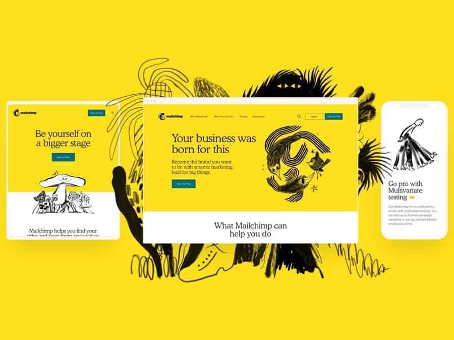
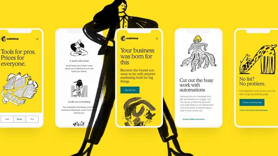
Described by the brand as “free and expressive”, these illustrations mimic a surrealistic style and provide structure to the many inspiring voices that exist within their ecosystem.
The diverse and unexpected nature of their visuals work wonderfully to present an idea of there being unlimited possibilities with the brand.
Mailchimp’s use of a limited colour palette also helps them stand out and retain a sense of consistency in their branding.
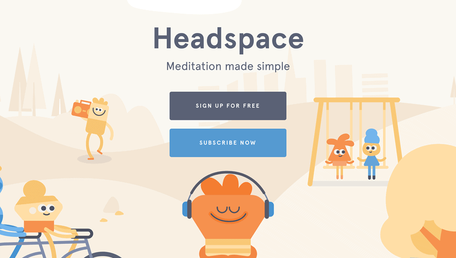
2) Headspace
The designers at Headspace took a more forward approach in using soft, muted colours and simple, clean shapes to reinforce the brand’s relaxed and positive tone.
The playful use of illustrations also helped in breaking down the often complex and heavy concept of meditation creatively, and captured the essence of meditation in ways that real life images can’t.
The visual representations made the final product more relatable and easy to understand in a way that’s less daunting as well.
3) Slack
As mentioned, it’s important to figure out which illustration style would fit your brand’s identity and messaging before we get our hands dirty and go all out into coming up with visuals.
With all the choice that there is, it can be difficult to find and stick with a particular look.
One brand that overcame this would be Slack, who simply made sure that they added their brand logo on their illustrations, clearly branding it as theirs.

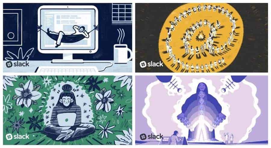
We can see that they weren’t afraid to explore and went all out to create interesting designs that stand out.
Despite being a tech brand, we can see how the use of illustrations create a warm and personable vibe for the brand.
In that, their online platform became much more engaging and fun for their users while improving their user experience as a whole.
However, be careful not to stray too far as well. With Slack, we can see how their playful illustrations remain polished, keeping the brand looking professional and reliable.
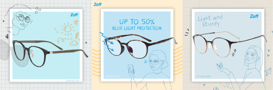
4) Zoff
We had the opportunity to work with Japanese spectacles brand Zoff and featured some lovely illustration work on their Singapore social media platforms.
Although the art style isn’t a part of their overall branding, they showcased a fun mix of illustrations and actual photographs of their glasses, evoking a sense of playfulness whilst keeping it minimalist and chic.
At the end of the day, the possibilities are endless! There’s so much you can explore and do with illustrations.